Rensselaer Polytechnic Institute
Rethinking Print Content Strategy
User experience isn’t just for the digital space.
The cornerstone of any admissions marketing campaign, the printed viewbook has a couple key advantages over emails and social media posts: longevity and scope. It sticks around for awhile on desks and kitchen tables, acting as a conversation starter for parents and students. It also provides a ton of real estate for telling your story.
Representing an entire institution in one publication is a big undertaking. While it’s important for a viewbook to contain a comprehensive overview of what the school has to offer, it’s essential to keep the reader’s experience in mind — and to do so, simplicity is key. The piece should drum up excitement, without making students feel like they need to complete a lengthy reading assignment just to learn a little more.
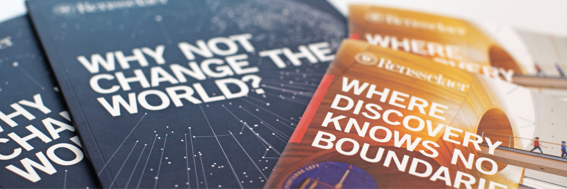
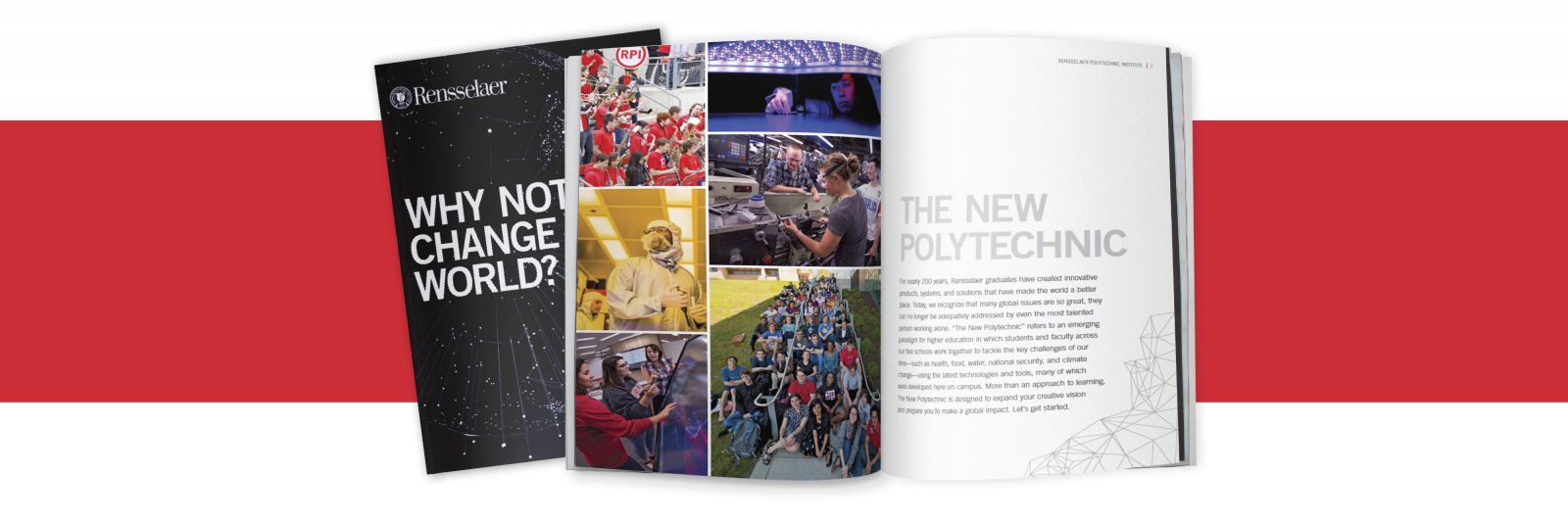
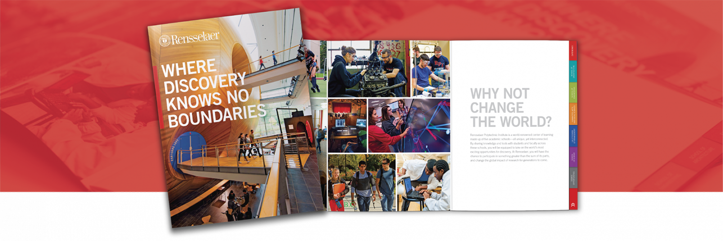
When Rensselaer Polytechnic Institute approached us to revamp two of their print publications — a full-length viewbook and shorter road brochure — we set out to establish what might be missing from these already attractive pieces, and ultimately created publications that more effectively delivered substantive information about this well-respected institution.
Conducting Original Research
To gather feedback on the existing Rensselaer viewbook compared to competitors’ publications, and inform strategy, we hosted a focus group with high school juniors and seniors, and their parents.
Both students and parents agreed that the Rensselaer content was far too long and dense, making them less likely to read it. They craved something more succinct and easy to navigate. They also preferred more dynamic photos of students being active on campus, as found in other samples shown.
The group felt the old cover of the Rensselaer book was a bit stale and predictable — it could have come from any college. Audiences did, however, appreciate that the pub grouped information into individual sections for each academic school.
Applying Our Findings
Given the feedback, our mission was clear. We needed to prioritize the presentation of information and tighten the copy, making the pieces more scannable. Key changes included:
- To capture the right type of imagery and build an asset library, we organized an extensive photoshoot.
- To jazz up a boring cover, we took a more conceptual approach that reinforced the school’s brand message.
- To make navigating the book easier, we restructured the interior sections and condensed the copy.
- To combat reader fatigue, we strategically incorporated graphic facts, making key proof points more prominent.
- To avoid overloading the book (and make it easier to measure readers’ engagement), we employed prominent URLs throughout and offered more in-depth content online.
Carrying it Through
We took similar steps for the road brochure. The biggest change here was that the prior brochure was actually broken out into two pieces. We combined them into one highly impactful piece that featured a tabbed wayfinder system. This consolidation made the publication more user friendly, both for the traveling counselors and the students getting to know the school.
Key Takeaways
Feedback from staff and faculty, as well as students and counselors, has been overwhelmingly positive. In fact, Rensselaer has even incorporated much of the design from the book into their website. Early-decision applications were up by about 30% at the time of this writing, and Rensselaer’s Fall Open House reached full capacity.