There are over 1,000 colleges and universities that have adopted Slate as their CRM of choice, including some of the top-ranked institutions in the nation.
With this in mind, we remind our partnering colleges and universities that your out-of-the-box application status portal is likely shared with dozens of your peer institutions. This means that any number of your applicants are comparing their experience on your website, application, and portals with other schools on the list.
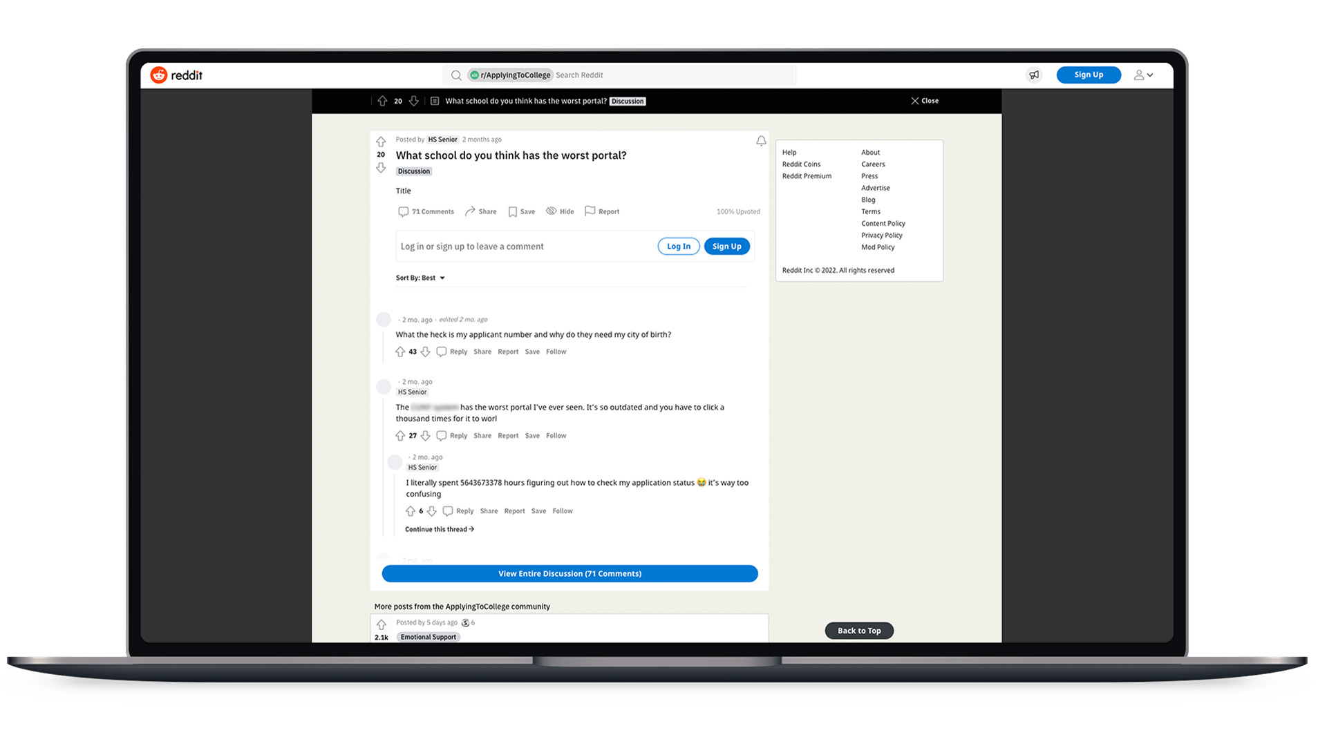
How do we know? Students share their opinions for the world to read. Here’s a recent example from Reddit:
The Question: What school do you think has the worst portal?
The Responses:
- “[REDACTED] has the worst portal I’ve ever seen. It’s so outdated and you have to click a thousand times for it to work.”
- “I literally spent 5643673378 hours figuring out how to check my application status it’s way too confusing.”
- “[REDACTED]. Looks straight out of the 90s.”
- “What the heck is my applicant number and why do they need my city of birth?”
- “It’s boring and poorly designed.”
Excerpts from various posts on Reddit talking about the college search experience
Now, we get that portals in Slate can be intimidating, even if you know a little about HTML and CSS. But if you keep the following three areas in mind when (re)designing and (re)building your next portal, your prospective students will likely thank you.
1. Branding
Considering that your pool is logging into several different Slate portals throughout their college search journey, this is an opportunity to stand out. Improving your base .CSS file can have a huge impact on a student’s first impression of your page. Some of the best-looking portals we create have some impressive static content blocks with some personalized images, information, and beyond.
2. Relevance
Just because Slate offers a widget for every occasion does not mean that you need to place them all on the same page at the same time. Think about what a user needs to know and what is important to them. Use filters to show relevant information based on where a student is in the funnel.
Pro-tip: Liquid markup works in portals — show your prospects the love by personalizing your messaging based on their interests!
3. User Experience
Oh, Slate offers a three-column layout for a portal page, that’s neat! Well, considering we see over 60% of engaged admitted students using mobile devices, designing a sleek, responsive portal page should be a top priority when laying out your portal components.
If you have a lot of information to share with your prospective students, spread it out and add some tabs!
We Can Help
Spark451’s SparkAssist service can help you tap into the full power of your Slate instance by picking up wherever you and your team left off. Our experienced Slate administrators, content creators, and higher education marketing experts have the context, creativity, and technical expertise to beautify, personalize, and improve the digital experience of your prospective students, parents, and beyond.
Because we know every admissions office is different, we offer a wide variety of customizable subscription– and project-based models to ensure we’re delivering as much — or as little — as needed to meet your team’s specific needs. Let’s connect to discuss.