
Western New England University
Happy Anniversary! Now, what?
Getting the most out of your institution’s next major milestone.
An anniversary year means many things to an institution. It’s a time to celebrate the school’s history, unify and engage the community through a series of events, and project a fresh vision for the future. It’s an exciting time that is filled with opportunity, and it tends to trigger a burst of activity from fundraising initiatives to dressing up the campus.
When our long-time partner, Western New England University, was getting ready for its centennial celebration, the university leadership invited Spark451’s creative team to lend a hand by developing a comprehensive and versatile identity to represent this special period in the university’s history.
Defining the Objectives
In order to create flexible identity elements that could be leveraged effectively throughout the centennial period, we needed to clearly delineate both the vision and the planned creative approaches. We determined it needed to be:
Celebratory
It was clear that the university needed a new symbol — and an accompanying visual identity — around which stakeholders, donors, students, and the greater community could rally. As the centennial is also tied into the capital campaign, the logo and related materials would need to inspire donors by projecting a positive vision of where the institution is headed.
Prestigious and Refined
Within the last decade, Western New England University achieved university status — a significant point of pride. The centennial was a perfect opportunity to boost the community’s perception of the institution and convey a sense of prestige to reflect the high caliber of institutional offerings.
Diverse, but Unified
The university’s separate schools and colleges, along with a wide variety of undergraduate, graduate, and continuing studies programs, presented a challenge in creating an identity that would convey harmony. The resulting mark needed to represent a single, unified institution enriched by a diverse, supportive community, yet allow for flexible use across a wide variety of materials, including digital formats and campus banners.
Presenting a Spectrum of Options
As part of our research, we critically analyzed a wide variety of other anniversary logos — both for academic institutions and those outside the industry — to establish what effective elements they shared and what to avoid. Also, having helped shape the university’s brand and graphic styles over the years, we had a good handle on how to apply those established best practices to the various directions.
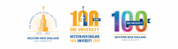
Next, we established three distinct approaches:
- The first was a solid extension of existing brand elements and was inspired by classic institutional seals to reflect the rich history.
- The second offered a cohesive typographic lock-up that reimagined elements of WNE’s graphic identity in a more polished, flexible way — a mark that could temporarily replace the existing logo for the duration of the anniversary.
- The third, inspired by the multifaceted, welcoming community of the institution itself, was a modern approach with a bright, celebratory color palette and bold graphic patterns.
Finalizing Our Approach
After a comprehensive presentation to the stakeholder community comprised of the President and representatives from enrollment management, marketing, constituent relations, and advancement services, we collected detailed feedback and a winner emerged.
Ultimately, we combined the refined typographic lock-up that could stand in for the university logo with the bold and colorful multifaceted patterns. This combination underscored the notion that the university’s vision for the future is inspired by many perspectives from a wide cross-section of people, yet will be carried out as a unified institution. The message it projected is that Western New England University was ready to celebrate one historic century and one bright future shared by one united community.

Applying the New Identity
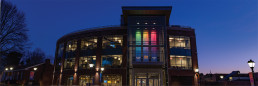
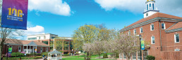
Once the key stakeholders coalesced around this direction, we designed campus-wide lamppost pennants as well as large, celebratory banners for the newly built University Commons — the main hub of dining and social activity — to “dress up” the campus for the celebrations.
Working closely with the Office of Marketing and External Affairs, we developed a special publication for the President to share with the community. The piece reflects on how far Western New England University has come in its first hundred years, and leaves the reader optimistic about the next hundred.
Earning Industry Recognition
The handsome anniversary identity started generating buzz in the industry even before the centennial year formally began. In fact, the new materials collected several gold awards in national competitions, such as The Collegiate Advertising Awards and the Educational Advertising Awards, for their creativity, design, functionality, message effectiveness, production quality, and overall appeal. Likewise, feedback from the campus community, as well as alumni, has been equally enthusiastic. The team at Spark451 is proud to have helped Western New England set the tone for the next exciting chapter in the university’s history.
We’d love to help you get the most out of your institution’s next big anniversary. To learn more about how Spark451 can help you achieve incredible results, download our Anniversary Package sheet, and then, feel free to reach out to us to discuss your options.